
You have the theory. You understand the math of the triangle. You have seen how a Tornado Chart can pinpoint your biggest threats. But in the real world, you are not managing three tasks in a vacuum. You are managing dozens, sometimes hundreds, in a complex project schedule.
The biggest hurdle for most project managers is not the math – it is the ‘data bridge.’ How do you get your carefully crafted schedule out of a static spreadsheet and into a living, breathing Monte Carlo simulation?
Today, we are moving from theory to production. We are going to build a complete, automated workflow. We will take a 5-task project schedule, export it, and run a full-scale risk report that compares distributions and identifies risk drivers automatically. If you have ever felt like your Excel sheet was a ‘dead’ document, this is the article that brings it to life.
The Problem: The ‘Static Schedule’ Trap
Most project managers live in Excel or MS Project. These tools are fantastic for planning, but they are fragile. They tell you what will happen if everything goes exactly according to plan, but they are silent about what happens when it doesn’t.

When you share a static Gannt chart, your stakeholders see a ‘final’ date. They don’t see the risk hidden behind those bars. By connecting your schedule to Python, you transform that static list into a dynamic engine. You move from ‘tracking’ to ‘simulating.’
The Workflow: From MS Project to Monte Carlo
The process is surprisingly simple. You do not need to rebuild your schedule from scratch. Here is the exact workflow:
- Copy your task list, durations, and predecessors directly from MS Project into an Excel sheet.
- Add two new columns at the end: ‘Optimistic’ and ‘Pessimistic’.
- For each task, enter your ‘best-case’ and ‘worst-case’ durations.
- Save the file as a CSV (e.g., ‘Project_Example_1.csv’).
- Donwload example CSV file
- Update path on your google drive – file_path = ‘/content/drive/MyDrive/Colab Notebooks/Monte Carlo Simulation/Project_Example_1.csv’
- Copy paste the script and run in your Colab.
By doing this, you keep all your hard-earned scheduling logic (like dependencies) but add the ‘range’ of uncertainty required for a simulation.
The Setup: Our 5-Task Example Data
For this walkthrough, we are using the exact data from our example file. This represents a typical sequence of tasks where some happen in parallel and some are dependent on others.
| Task Name | Duration (Most Likely) | Predecessors | Optimistic (A) | Pessimistic (B) |
| Task 1 | 3 | – | 1 | 6 |
| Task 2 | 7 | 1 | 3 | 14 |
| Task 3 | 4 | 1 | 2 | 6 |
| Task 4 | 6 | 2 | 4 | 9 |
| Task 5 | 3 | 4 | 1 | 7 |
This data structure is all the computer needs to start ‘rolling the dice.’
Try It Yourself: The Complete Automation Script
If you are feeling brave or if you know Python, open Google Colab and paste the code below. This script is a “ready-to-run” version that mounts your Google Drive, reads your CSV, handles complex dependency chains, and produces a three-part visual report.
import pandas as pd
import numpy as np
import random
import matplotlib.pyplot as plt
from google.colab import drive

# --- 1. MOUNT DRIVE AND LOAD DATA ---
drive.mount('/content/drive', force_remount=True)

# Update this path to match your file location in Google Drive
file_path = '/content/drive/MyDrive/Colab Notebooks/Monte Carlo Simulation/Project_Example_1.csv'

try:
    df = pd.read_csv(file_path)
    df.columns = df.columns.str.strip()
    print('Data loaded successfully.')
except Exception as e:
    print(f'Error loading file: {e}')

iterations = 10000

# --- 2. SIMULATION FUNCTIONS ---
def get_triangular(a, m, b):
    u = random.random()
    fc = (m - a) / (b - a)
    if u < fc:
        return a + (u * (b - a) * (m - a))**0.5
    else:
        return b - ((1 - u) * (b - a) * (b - m))**0.5

def get_pert(a, m, b):
    alpha = 1 + 4 * ((m - a) / (b - a))
    beta = 1 + 4 * ((b - m) / (b - a))
    return a + (random.betavariate(alpha, beta) * (b - a))

# --- 3. THE SCHEDULE SIMULATOR ---
def simulate_project(dist_type='triangular'):
    finishes = np.zeros(len(df))
    for i in range(len(df)):
        row = df.iloc[i]
        a, m, b = row['Optimistic'], row['Duration'], row['Pessimistic']

        dur = get_triangular(a, m, b) if dist_type == 'triangular' else get_pert(a, m, b)

        pred = row['Predecessors']
        if pd.isna(pred) or str(pred).strip() == '' or str(pred).lower() == 'nan':
            start_time = 0
        else:
            p_list = [int(float(p.strip())) for p in str(pred).split(',') if p.strip()]
            start_time = max(finishes[p - 1] for p in p_list) if p_list else 0

        finishes[i] = start_time + dur
    return np.max(finishes)

# --- 4. RUN SIMULATIONS ---
print('Running simulations...')
tri_totals = np.array(sorted([simulate_project('triangular') for _ in range(iterations)]))
pert_totals = np.array(sorted([simulate_project('pert') for _ in range(iterations)]))

# --- 5. COMPARISON RESULTS ---
def calculate_metrics(data):
    return {
        'Mean': np.mean(data),
        'P10': np.percentile(data, 10),
        'P50': np.percentile(data, 50),
        'P90': np.percentile(data, 90)
    }

tri_m = calculate_metrics(tri_totals)
pert_m = calculate_metrics(pert_totals)

print('\n--- Comparison Results ---')
print(f"{'Metric':<16} | {'Triangular':<10} | {'Beta (PERT)':<10}")
print('-' * 42)
print(f"{'Expected Mean':<16} | {tri_m['Mean']:<10.2f} | {pert_m['Mean']:<10.2f}")
print(f"{'P10 (Optimistic)':<16} | {tri_m['P10']:<10.2f} | {pert_m['P10']:<10.2f}")
print(f"{'P50 (Median)':<16} | {tri_m['P50']:<10.2f} | {pert_m['P50']:<10.2f}")
print(f"{'P90 (Safe)':<16} | {tri_m['P90']:<10.2f} | {pert_m['P90']:<10.2f}")

# --- 6. SENSITIVITY ANALYSIS (TORNADO) ---
baseline_finishes = np.zeros(len(df))
for i in range(len(df)):
    row = df.iloc[i]
    pred = row['Predecessors']
    if pd.isna(pred) or str(pred).strip() == '' or str(pred).lower() == 'nan':
        start = 0
    else:
        p_list = [int(float(p.strip())) for p in str(pred).split(',') if p.strip()]
        start = max(baseline_finishes[p - 1] for p in p_list) if p_list else 0
    baseline_finishes[i] = start + row['Duration']

swings = []
for i in range(len(df)):
    row = df.iloc[i]
    swings.append({
        'Task': row['Task Name'],
        'Opt': row['Optimistic'] - row['Duration'],
        'Pess': row['Pessimistic'] - row['Duration'],
        'Width': row['Pessimistic'] - row['Optimistic']
    })

tornado_df = pd.DataFrame(swings).sort_values('Width')

# --- 7. VISUALIZATION ---
plt.figure(figsize=(22, 7))

# Plot 1: S-Curve
plt.subplot(1, 3, 1)
probs = np.linspace(0, 1, iterations)
plt.plot(tri_totals, probs, label='Triangular', color='blue', linewidth=2)
plt.plot(pert_totals, probs, label='Beta/PERT', color='green', linewidth=2)
plt.axhline(0.90, color='red', linestyle='--', label='90% Confidence')
plt.title('Project S-Curve (Confidence)')
plt.xlabel('Total Project Days')
plt.ylabel('Probability')
plt.grid(alpha=0.3)
plt.legend()

# Plot 2: Distribution
plt.subplot(1, 3, 2)
plt.hist(tri_totals, bins=50, alpha=0.4, color='blue', label='Triangular', density=True)
plt.hist(pert_totals, bins=50, alpha=0.4, color='green', label='Beta/PERT', density=True)
plt.title('Distribution of Outcomes')
plt.xlabel('Total Project Days')
plt.ylabel('Frequency')
plt.grid(alpha=0.3)
plt.legend()

# Plot 3: Tornado
plt.subplot(1, 3, 3)
plt.barh(tornado_df['Task'], tornado_df['Opt'], color='seagreen', label='Optimistic Swing')
plt.barh(tornado_df['Task'], tornado_df['Pess'], color='indianred', label='Pessimistic Swing')
plt.axvline(0, color='black', linewidth=1)
plt.title('Tornado Chart: Risk Drivers')
plt.xlabel('Days Deviation from Baseline')
plt.legend()

plt.tight_layout()
plt.show()


--- Comparison Results ---
Metric           | Triangular | Beta (PERT)
------------------------------------------
Expected Mean    | 21.33      | 20.17
P10 (Optimistic) | 17.53      | 16.74
P50 (Median)     | 21.24      | 20.07
P90 (Safe)       | 25.25      | 23.65
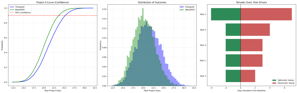
Interpreting Your Professional Risk Report
Once the script finishes, you are looking at the “Nerve Center” of your project risk. Here is how to explain these results to your stakeholders.
1. The Comparison Table: P90 vs. Reality
Look at the P90 (Safe) row in the printed table. This is the date you should use for your external commitment. You will notice that the Triangular P90 is likely several days higher than the Beta P90.
- The Insight: The Triangular result is your ‘Insurance Policy.’ It covers the ‘unknown unknowns’ that the more optimistic Beta model might miss.
2. The S-Curve: Measuring Confidence
The S-Curve is your most powerful visual.
- Steepness: If the lines are very steep, your project is predictable. If they are flat and stretched out, your project is a wildcard.
- The Red Line: Where the blue and green lines cross the 0.90 (90%) horizontal line tells you your project deadline with high confidence.
3. The Distribution of Outcomes: Visualizing the “Spread”
The middle graph (the histogram) shows you where the most “mass” of your project duration lives.
- The Triangular distribution (blue) will look wider and flatter.
- The Beta/PERT distribution (green) will look like a tighter bell curve.
- The Insight: If there is a massive gap between the peaks of these two curves, your project is highly sensitive to how you estimate risk.
4. The Tornado Chart: Your Battle Plan
This identifies your “Risk Drivers.” The tasks at the top with the longest red bars are your biggest threats.
- Action Item: If ‘Task 2’ is at the top, do not waste time micromanaging ‘Task 5’ at the bottom. Even if Task 5 goes perfectly, it won’t move the needle. You must focus your energy on the top of the tornado.
Summary: From Guessing to Knowing
By taking your MS Project data and adding just two columns, you have unlocked a professional level of risk insight. You are no longer guessing. You have a safe deadline backed by 10,000 simulations and a prioritized list of tasks that actually drive your project risk.
This workflow is repeatable. Every time your schedule changes, you simply hit ‘Run,’ and your entire risk profile updates instantly. This is the new standard for modern project leadership.